When evacuation signs trigger the wrong instinct
How £105,000 of Lincolnshire road markings exposed the psychology gap in Britain’s climate planning
The morning after the great surge, the seals were gone. For decades, hundreds of grey seals had gathered each winter at Donna Nook Nature Reserve, their pups scattered across the dunes like pale boulders. But on December 6, 2013, only saltwater remained where mammals had once bred, the surge having swept them into the North Sea alongside caravans, cars, and fragments of lives built too close to water’s edge.
That tidal surge exceeded even 1953’s catastrophic floods that killed 307 people. In Boston alone, more than 800 homes flooded across 55 streets. At Gibraltar Point, waves topped defences that had protected the coast for generations. Across Lincolnshire, 44 people required rescue from waters that transformed familiar landscapes into treacherous seascapes.
Yet the most enduring legacy of that terrifying night may be something far more mundane: 13 road signs bearing two simple letters that have divided communities, deterred investment, and exposed how Britain communicates climate threats.
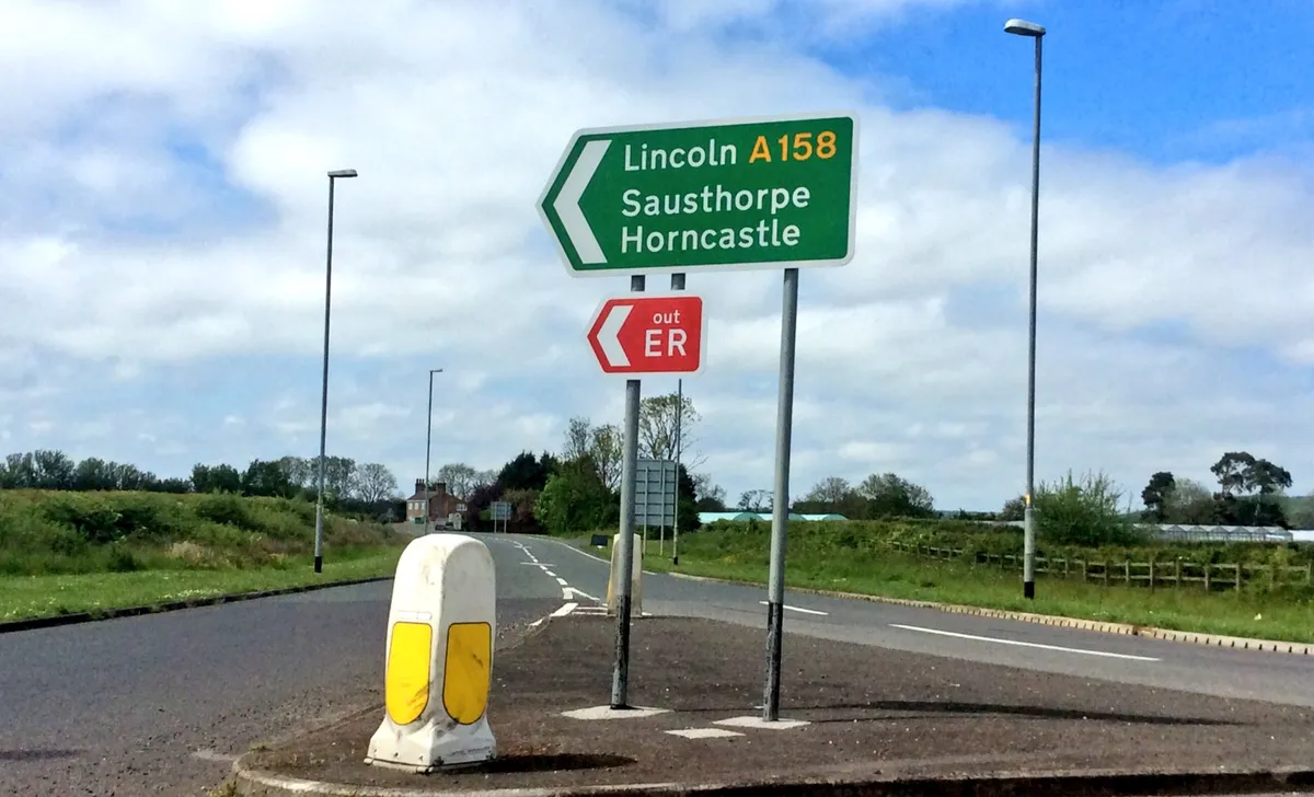
The psychology of emergency colours
The “ER” signs—evacuation route markers now scattered across coastal roads—represent one of Britain’s most ambitious flood evacuation experiments. Costing £105,000 and jointly funded by three agencies, they mark predetermined routes designed to channel residents away from danger during extreme weather.
The design appears beautifully simple: a stark red background with white “ER” lettering, impossible to misunderstand even in poor visibility. Emergency planners chose the colour deliberately—signalling danger, demanding attention, commanding authority. The psychology seems obvious.
Except it’s completely wrong.
Groundbreaking research using virtual reality evacuation scenarios has revealed a startling paradox: whilst people consistently report preferring the traditional colour when asked directly, they overwhelmingly walk toward green signs during simulated emergencies. Studies at the University of Wisconsin found that participants who verbally endorsed conventional evacuation signage nonetheless chose green doors when actually navigating virtual crises.
The research challenges what scientists call the “local exposure hypothesis”—the assumption that people respond to colours they’ve learned to associate with safety in their environment. Instead, it supports the “semantic association hypothesis”: under stress, humans default to universal meanings that transcend local conventions. Green means go, safety, hope. The alternative, whatever its authoritative intention, triggers psychological barriers that prove deadly when seconds matter.
Dr. Sarah Kinateder, who led the virtual reality research, found the disconnect so pronounced that emergency planners might be inadvertently designing evacuation systems that contradict human instinct. “Observers, and perhaps designers, do not always anticipate how occupants will behave in emergency situations,” her team concluded. The implications for real-world evacuation systems are profound: signs designed to save lives might actually hinder escape.
The business of acknowledging risk
The psychological disconnect became practical conflict when Lincolnshire’s business community encountered the signs. Members of the Skegness Business Forum didn’t mince words: the evacuation markers were “sending out the wrong message” to potential investors. One forum member reported that a company had withdrawn investment plans specifically after seeing the signage, apparently concluding that any area requiring evacuation routes was too risky for expansion.
“A joke,” was how some business leaders described the council’s strategy. The signs made vulnerability impossible to ignore, transforming abstract insurance statistics into daily visual reminders. For a coastal tourism economy dependent on projecting safety and reliability, the markers represented unwelcome honesty about environmental threats.
This tension reflects broader challenges facing coastal communities as climate change makes extreme weather routine. Should communities honestly advertise their vulnerabilities, potentially deterring investment but improving preparedness? Or should they downplay threats to maintain economic confidence, potentially increasing casualties when disasters strike?
The illusion of self-reliance
Behind the simple signage lies remarkably ambitious assumptions: emergency planners expect 85% of coastal residents to “self-evacuate” during extreme flooding, following predetermined routes to safety without assistance. This optimism contradicts virtually every lesson from major evacuation disasters.
Hurricane Katrina demonstrated catastrophically how evacuation systems collapse when assumptions prove wrong. Despite mandatory orders, thousands remained in New Orleans as the storm approached. Those who attempted to leave often found themselves trapped in gridlocked traffic or stranded at collection points where promised buses never materialised.
Research reveals the complexity underlying apparently simple decisions to flee. Social capital—networks of trust and reciprocity within communities—proves crucial for successful evacuation. People with strong community connections heed warnings and assist vulnerable neighbours. Areas with weak social networks experience evacuation failures even when physical infrastructure functions perfectly.
The Lincolnshire system ignores these social dynamics entirely. The markers provide directional guidance but no supporting infrastructure: no contraflow traffic management, no fuel stations, no emergency shelters, no communication systems. They direct people onto potentially congested rural roads with no provisions for the practical necessities of mass movement.
The signs’ exclusion from satellite navigation systems eliminates the one guidance tool likely to function when traditional signage becomes invisible during extreme weather. This decision reflects touching faith in the visibility of small road signs during the precise conditions—storms with 100mph winds and torrential rain—when evacuation becomes necessary.
Lessons from across the Atlantic
American hurricane evacuation systems offer sobering comparisons. Developed through decades of catastrophic trial and error, US evacuation routes feature comprehensive infrastructure: contraflow traffic management converting entire highways into one-way evacuation arteries, strategically positioned fuel stations and rest areas, designated shelter facilities, and continuous communication systems.
Even these elaborate systems frequently fail. Hurricane Rita’s evacuation from Houston created traffic jams stretching hundreds of miles, with motorists trapped for over 20 hours in temperatures exceeding 100°F. More people died during the evacuation than from the hurricane itself.
The contrast with Lincolnshire’s approach is stark. Where American systems attempt to manage every aspect of mass movement, the markers essentially point toward higher ground and hope for the best. This minimalist approach may reflect budget constraints or British faith in individual resourcefulness, but it ignores extensive evidence about evacuation complexity.
The effectiveness of any evacuation system depends not merely on routes but on timing, capacity, communication, and social cohesion. Signs represent the visible tip of an enormous logistical iceberg that includes early warning systems, transportation assets, shelter capacity, emergency supplies, and coordination between multiple agencies. The red rectangles address only the most superficial layer of this challenge.
The storm that changed everything
Understanding the ER signs requires returning to the night that created them. The December 2013 surge combined multiple meteorological factors: a deep Atlantic depression, high spring tides, and sustained northerly winds reaching 100mph. The tidal coefficient—a measure of tidal strength—reached 94 on a scale where anything above 70 indicates very high tides.
At Spurn Head, tide heights reached 7.2 metres, approaching the maximum 7.6-metre level recorded in historical tide tables. But unlike the 1953 surge, the 2013 event featured lower wave heights and shorter duration, explaining why modern flood defences held whilst older earthen banks were overwhelmed. The landscape impacts included cliff retreat equivalent to 10 years of normal erosion compressed into a single night.
The surge’s psychological impact may have exceeded its physical damage. Modern flood warning systems prevented the mass casualties of 1953, but the event demonstrated that even sophisticated defences could be overwhelmed. The sight of seals swimming through flooded villages and rescue boats navigating high streets shattered assumptions about coastal safety that had developed over decades of relative calm.
Emergency planners faced a profound challenge: how to prepare for events that exceed living memory whilst maintaining public confidence in coastal communities. The ER signs represent their answer—visible reassurance that authorities had learned from 2013 and taken action to prevent future casualties.
The honest accounting
Yet the signs’ most important function may be forcing honest conversation about climate vulnerability. In an era when coastal development continues despite rising sea levels and increasing storm intensity, the red rectangles serve as daily reminders that some places simply cannot be defended indefinitely.
This uncomfortable honesty explains the business community’s resistance. Tourism and development industries depend on projecting confidence about coastal safety. Evacuation signs undermine this narrative by acknowledging that sometimes the only response to environmental forces is strategic retreat. The signs transform abstract climate projections into concrete admission that Britain’s relationship with water is changing.
The £105,000 investment, whilst substantial for simple signage, represents barely 0.1% of flood defence spending in the region. The Boston Barrier alone cost over £120 million, with additional millions spent on beach nourishment, improved early warning systems, and enhanced emergency response capabilities. In this context, the evacuation signs appear either remarkably cost-effective or dangerously under-funded, depending on perspective.
The broader question is whether the signs represent genuine emergency preparedness or psychological comfort for planners traumatised by 2013. If evacuation becomes necessary, will people follow red signs that contradict their instinctive preference for green? Will predetermined routes handle mass traffic flows without supporting infrastructure? Will communities trust systems that acknowledge their vulnerability?
The water’s edge
Twelve years after the great surge, Lincolnshire’s red signs continue dividing opinion. Emergency planners view them as essential infrastructure for climate adaptation. Business leaders see them as marketing disasters that advertise vulnerability. Psychologists suggest they may be designed exactly backwards from how humans actually behave in emergencies.
Perhaps all perspectives contain truth. The signs represent Britain’s struggle to balance honest risk communication with economic confidence, evidence-based planning with political reality, and human psychology with engineering logic. They embody the fundamental challenge facing coastal communities worldwide: how to live honestly with water in an age of rising seas and intensifying storms.
The seals, meanwhile, have returned to Donna Nook. Each winter they gather again on the dunes, rebuilding colonies that the surge scattered. Their presence offers hope that resilience is possible, that communities can recover from even the most devastating disruptions. Whether human communities can prove equally adaptable remains the question that red signs cannot answer.
The next great surge will test not just Lincolnshire’s flood defences but the deeper assumptions underlying its approach to climate risk. When that test comes, the effectiveness of two white letters may determine whether the investment in honest signage proved wise—or whether the business community’s fears about acknowledging vulnerability were justified. Until then, the ER signs stand as monuments to uncertainty, marking routes away from danger whilst highlighting the impossibility of escape from the climate reality they represent.